The word "gigil" comes from Filipino culture, but it’s something anyone can relate to: that irresistible urge to squeeze, to laugh, or to just be overwhelmed by excitement - an energy that perfectly reflects the agency’s persona: work that excites and feels fresh.
In 2024, we gave ourselves a rebrand to reflect where we’re headed. We’re still that agency that thrives on fun, relevant ideas, but with a more polished and modern look. It’s about balancing our youthful energy with a bit more professionalism, all while staying true to our roots in pop culture.


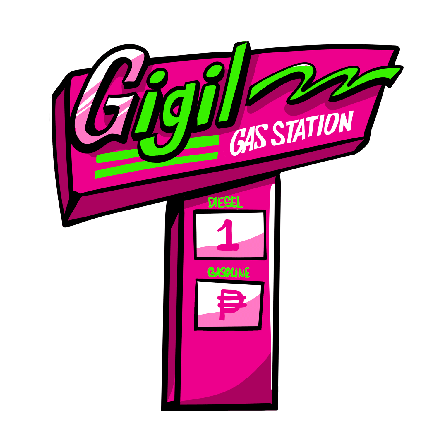
We kept the original GIGIL logo to highlight the brand’s professional vibe, then added a secondary one to bring out the fun, more playful side of GIGIL.


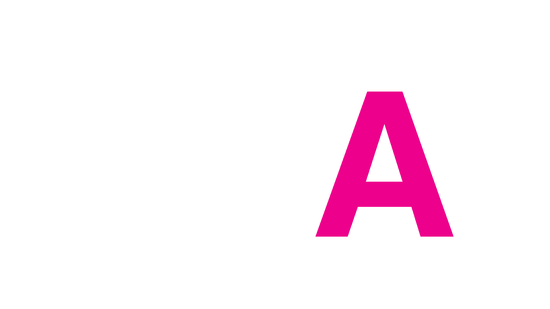
For the primary typeface, we chose something straightforward, bold, and clear to reflect Gigil’s more refined and professional side.


For the secondary typeface, we leaned into Gigil’s playful side capturing that irresistible urge to squeeze, much like the true essence of “gigil.”


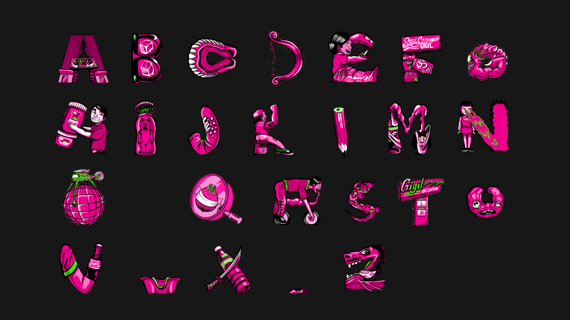
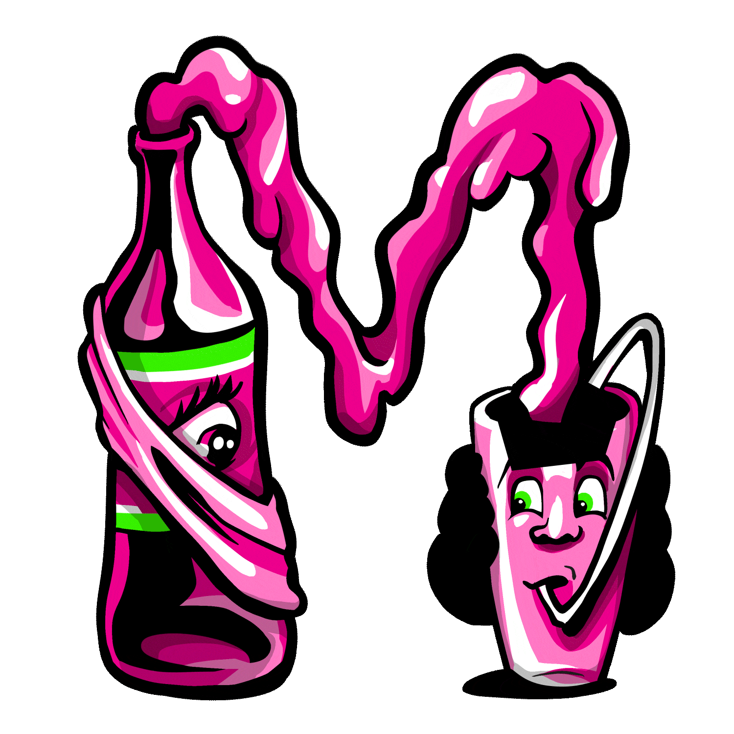
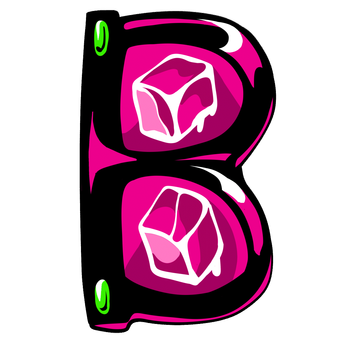
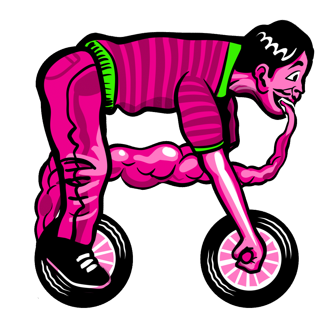
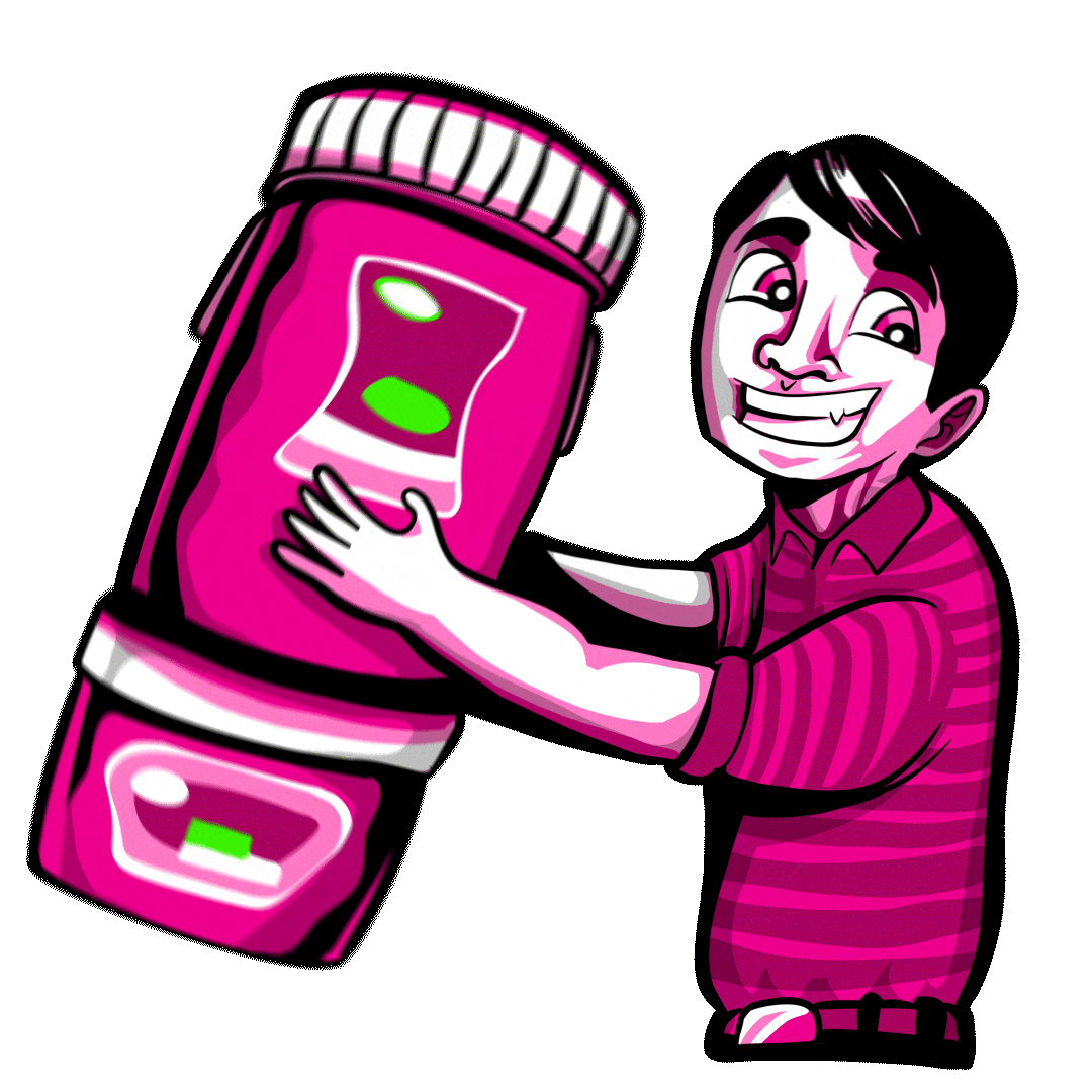
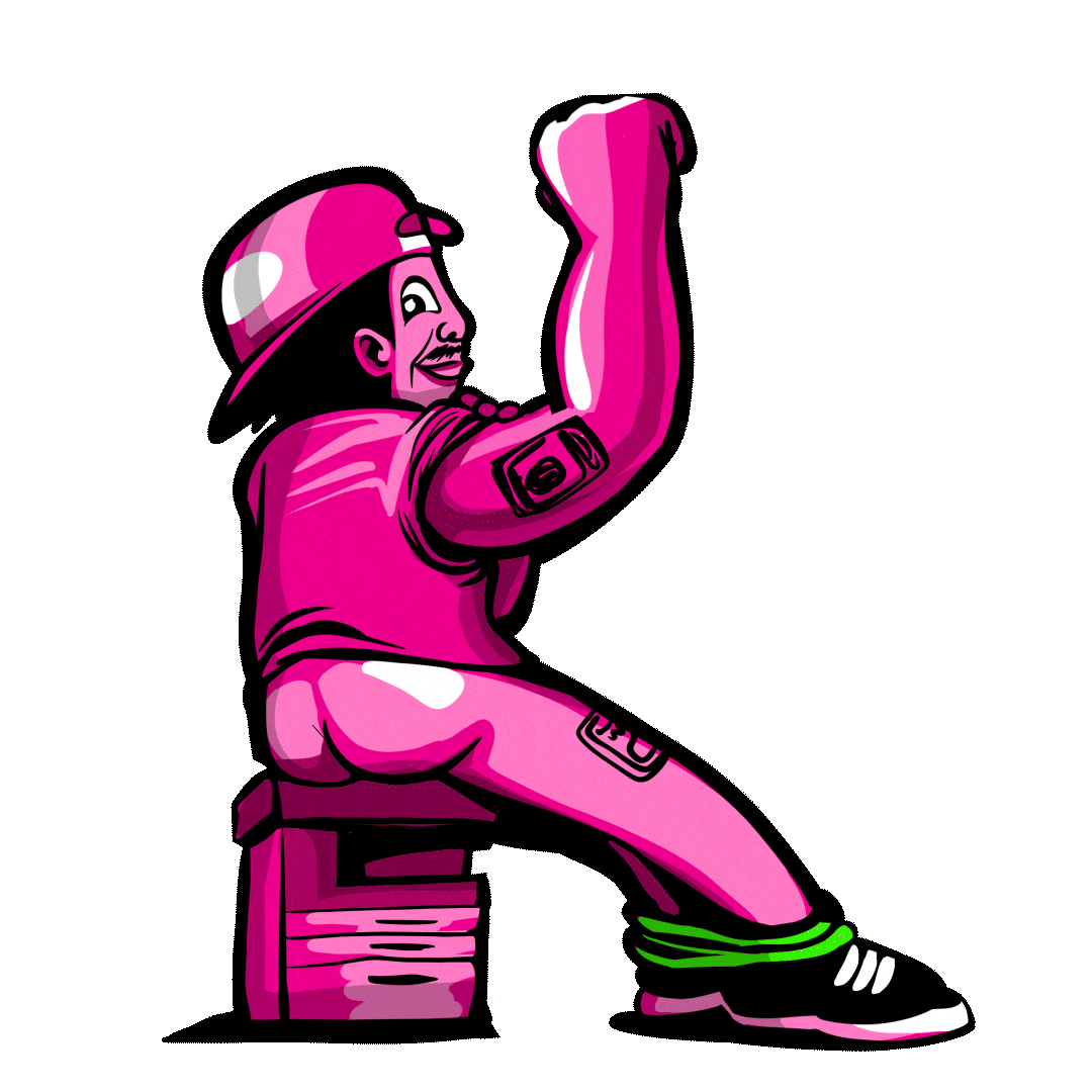
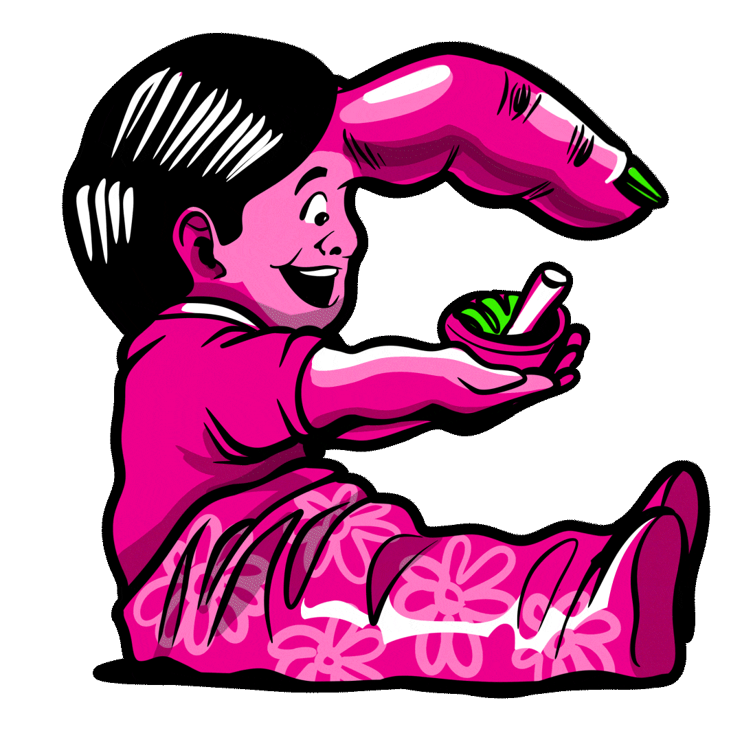
We collaborated with artist Quatro Los Baños to bring GIGIL’s illustrative typeface to life. Each letter is uniquely crafted, drawing inspiration from the iconic characters featured across GIGIL’s commercial work, turning familiar personalities into a cohesive visual language.
This work has also been recognized by Campaign Brief's The Work 2025.